Creating The New UI for Alpha 5
Brickadia's UI is being fully reworked, with a completely new theme. After many iterations, we're finally ready to share some of it!

For the last few posts, we've been focused on the technical aspects of Alpha 5. Now, however, it's finally time to talk about some of the work we've been doing on one of Alpha 5's most important features - the brand new UI style. Far more than a new lick of paint, Alpha 5's overhauled menus offer many improvements over their Alpha 4 ancestors.
A Journey From Old to New
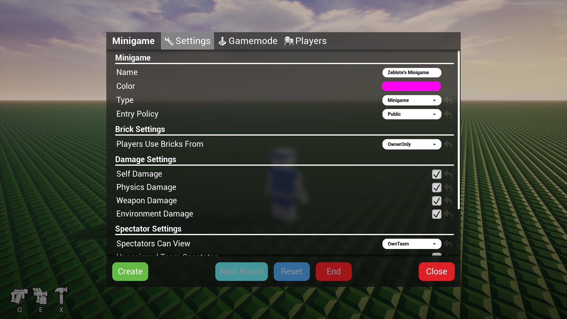
Most the old UI we created for Alpha 4 wasn't very pretty. You might even call it ugly, and you'd be right! It was kind of thrown together to quickly get something to work without any focus on design or usability. That's how we've ended up with this minigame editor, for example.
Since we've most recently upgraded the saving and loading UI, let's focus on it for the rest of this post. If you've played Alpha 4, you'll be familiar with the image below. It's got some basic functions - you got a list of builds, can select one, and click the load button. Oh, and if it magically breaks, we threw in a refresh button aswell, you know, just in case.
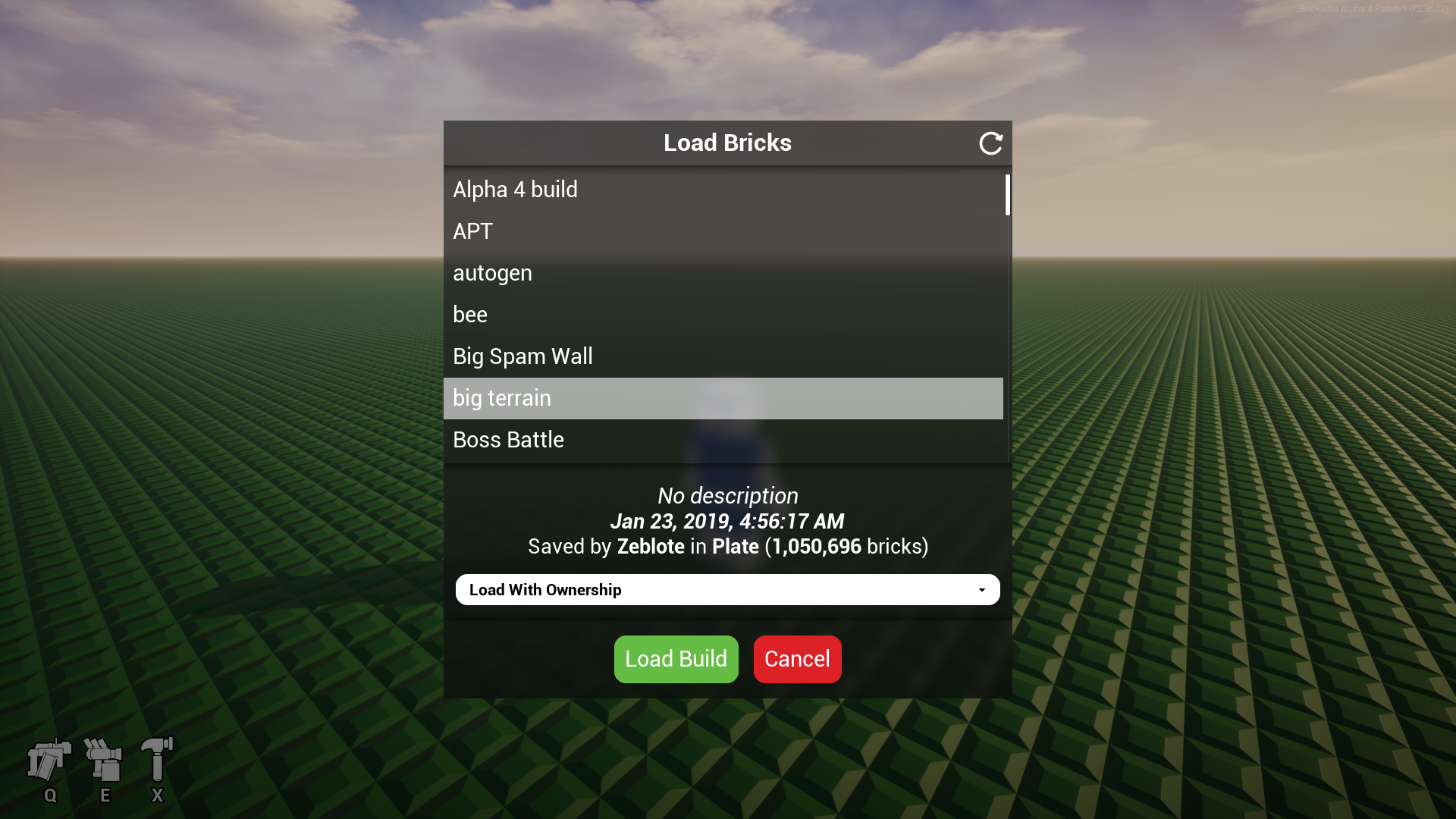
However, it's not visually appealing at all! This just won't do for the future. At this point, now a few months ago already, we started to draft a new UI style from scratch, outside of the engine. You can see one of the first mockups of that below. We definitely didn't get it right the first time, and it took many more iterations after this, though the blue-ish theme with bright colored highlights on buttons has remained till now - we just liked it that much!
The new mockup was very ambitious compared to the previous version, adding support for creating your own folders and tags, as well as including a tile view showing images for every build you have as you scroll. To make sure this wasn't going too far, we then created a prototype of this UI in-engine, which you can see below.
Playing around with the prototype revealed many issues we didn't realize before - such as the close button being extremely confusing in the top left as we kept clicking it to navigate out of a folder, only to close the entire UI instead. That was pretty much a non-starter. Here we also noticed extremely poor performance when opening and viewing a large folder. To fix the performance, we had to re-create the UI based around a custom tile view that only generates widgets for files actually on screen.
Following the prototype, we revised the new style another time with a new mockup, seen below. Close buttons are now always in the top right where they can't be confusing, window titles are obvious, and elements generally became smaller. We've swapped a couple elements around to be more in line with how we kept trying to use the prototype, such as placing the folder path view above the tile view for contents.
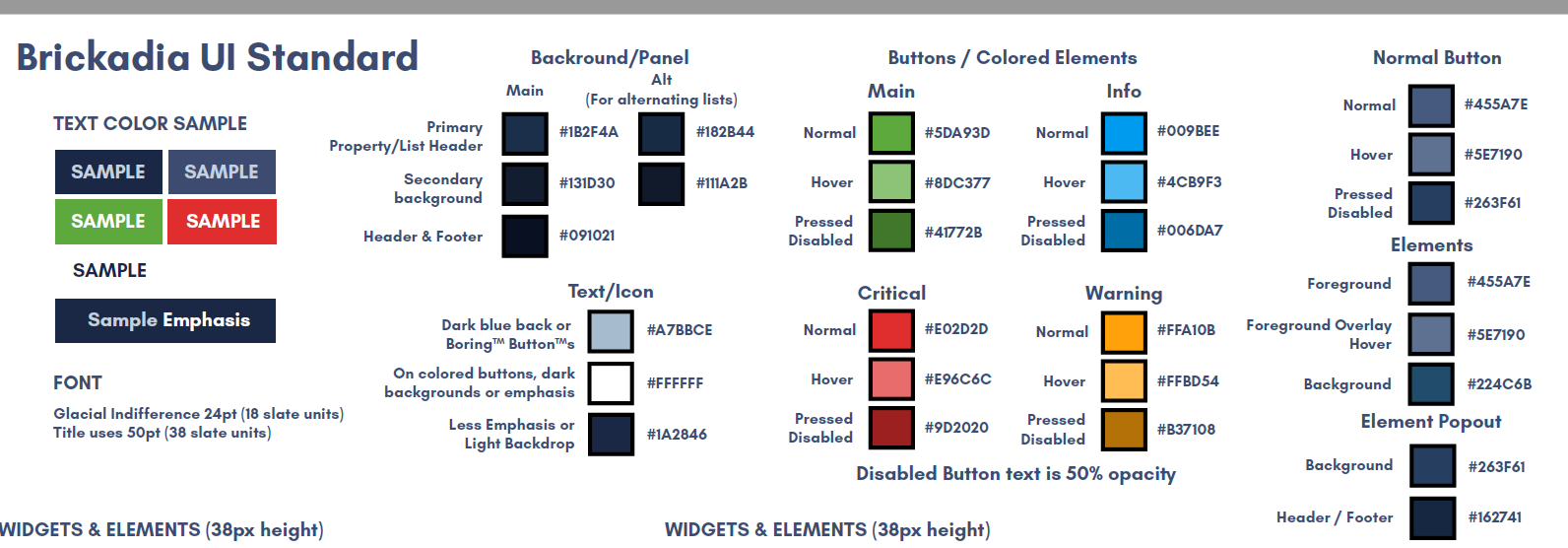
Around this time, it was also becoming more and more confusing to keep track of which elements should be displayed with which colors, so we decided to unify the many mockups and prototypes and lock down the color scheme in a single document that is easy to use as a reference during implementation. You can see a snippet of the file below.
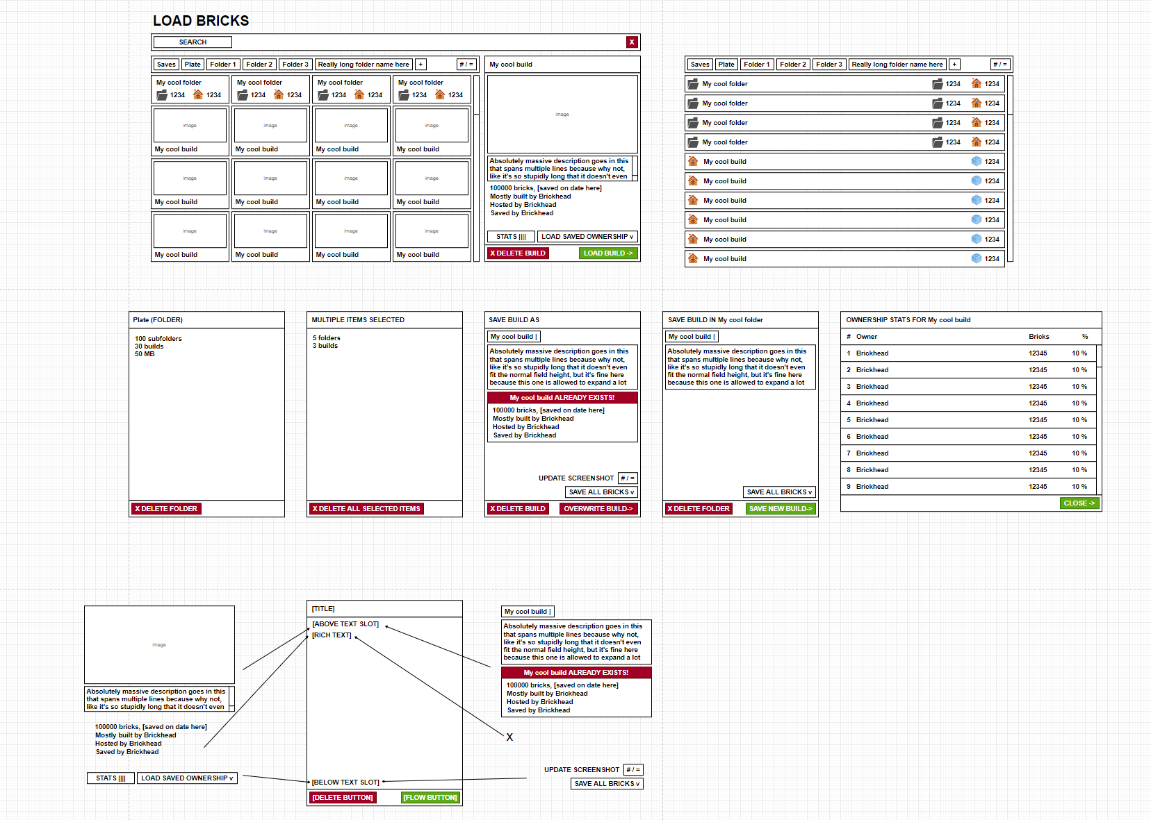
With the general layout and color scheme decided, and the insights from the previous prototype, we were able to plan out most of the actual implementation of the save/load UI ahead of time. You can see the structural mockup below, purposely created without colors or attention to fine details like paddings, since those are regulated by the UI standard and can mostly be applied without thinking about it too much.
The structural mockup allows us to understand all the different states the dialog can be in, and determine how we can best compose it from individual widgets.
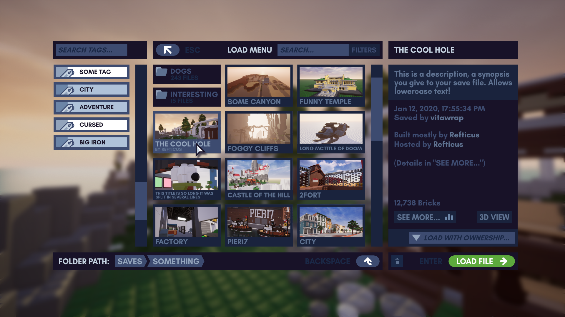
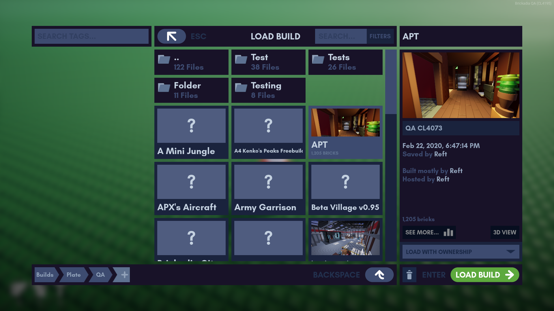
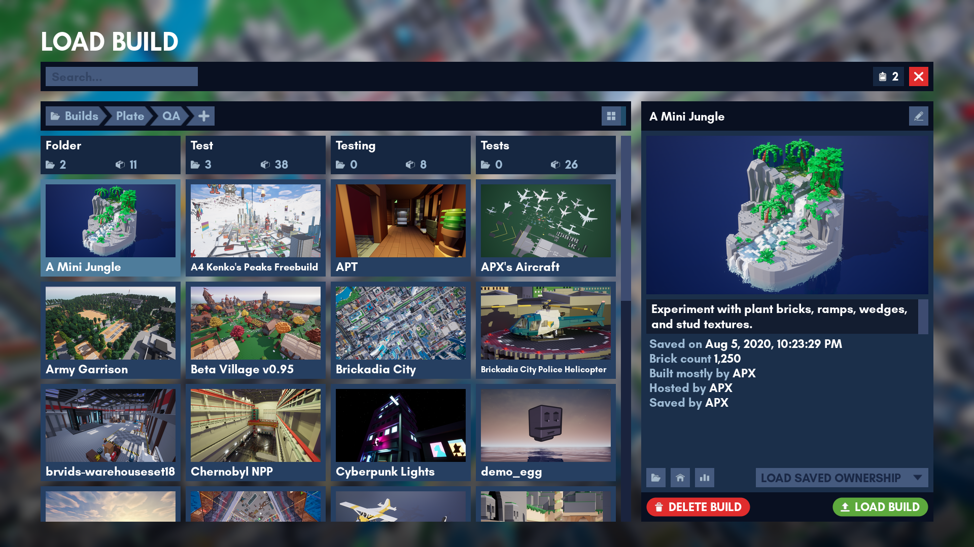
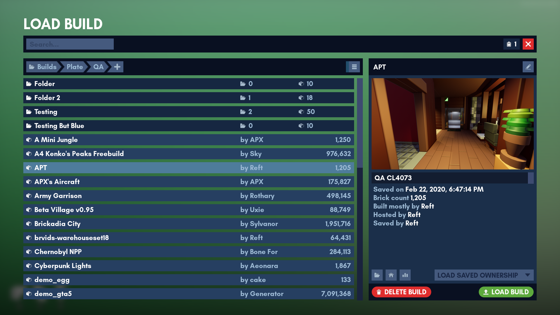
Phew, enough talking about mockups and styles! Let's look at the finished product below. This is the new Load Build dialog in Alpha 5.
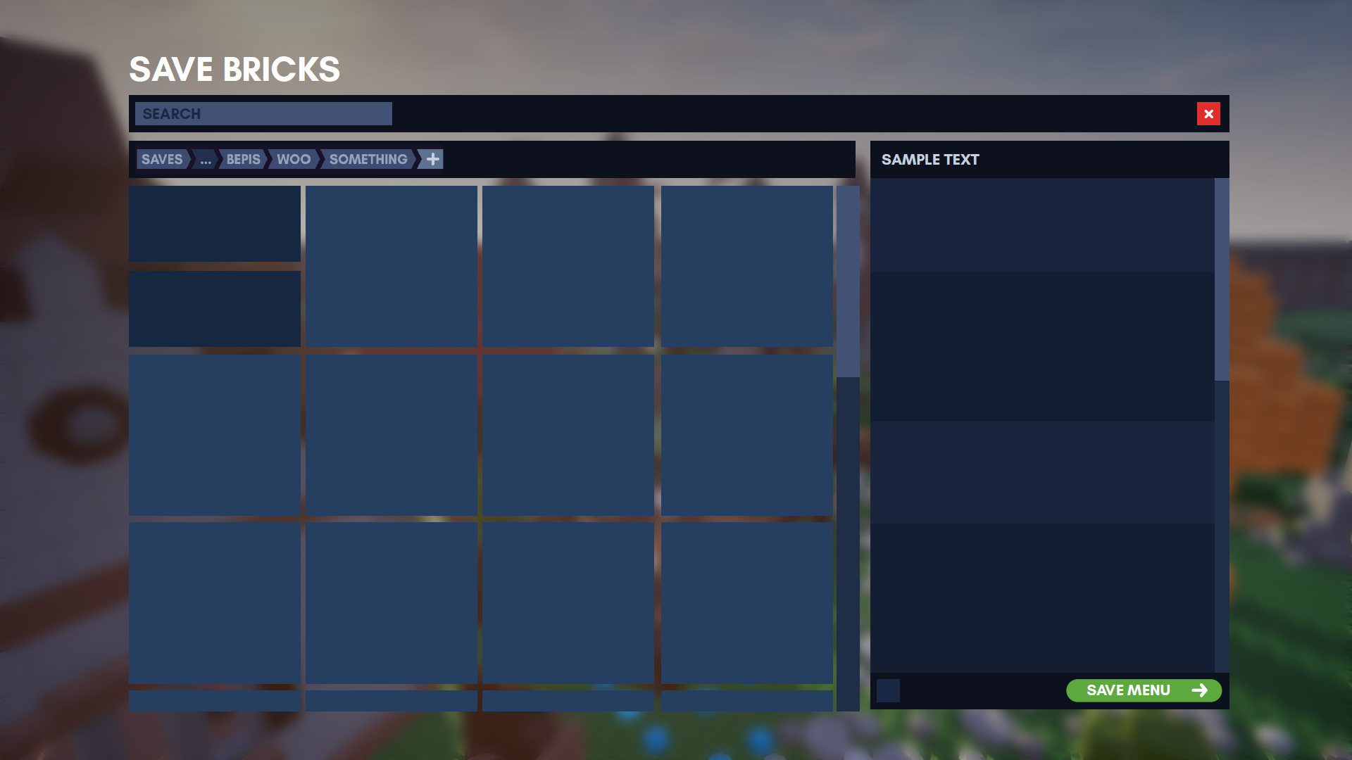
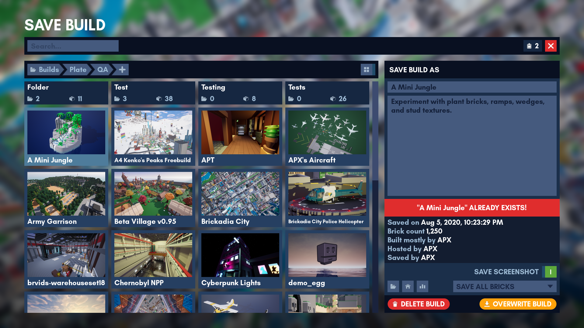
Of course, we also have a matching Save Build dialog. It shares some common functionality such as browsing around, but has quite different behavior in details.
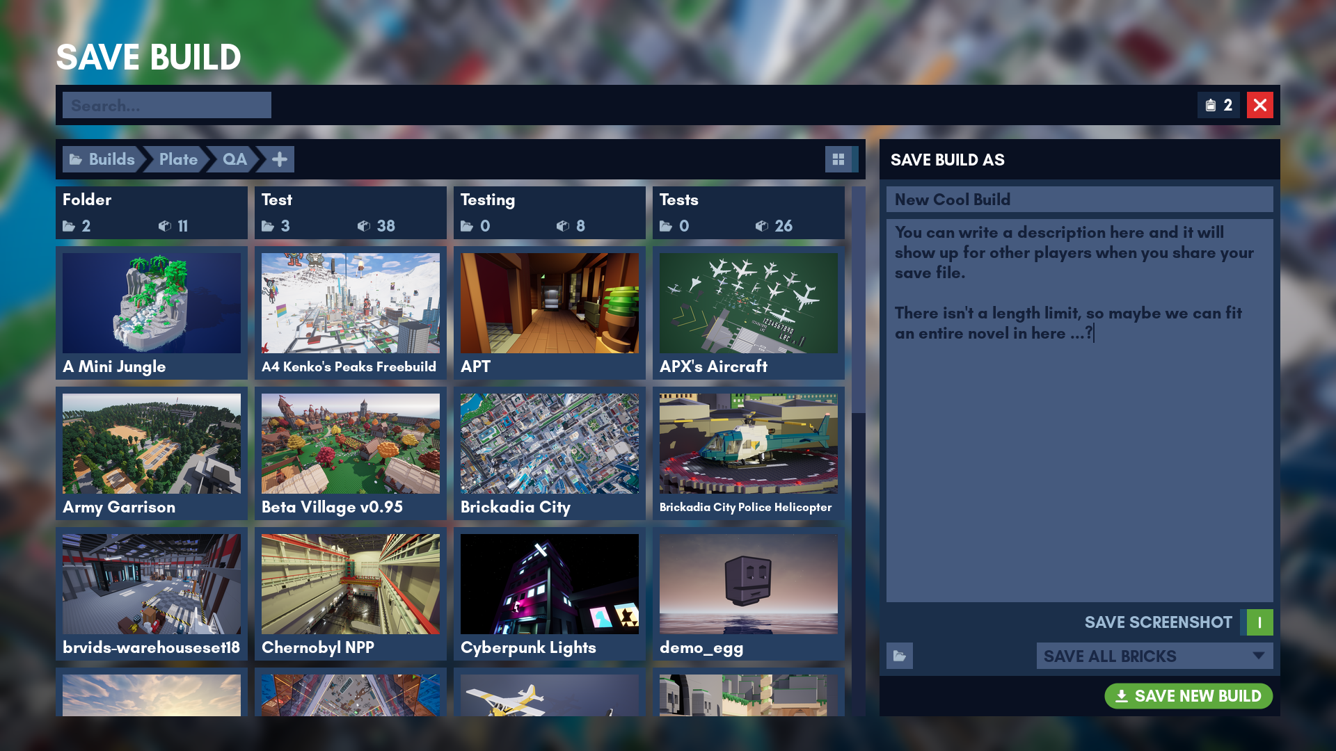
For example, the details panel (on the right) has to change completely if you've entered a name that already exists.
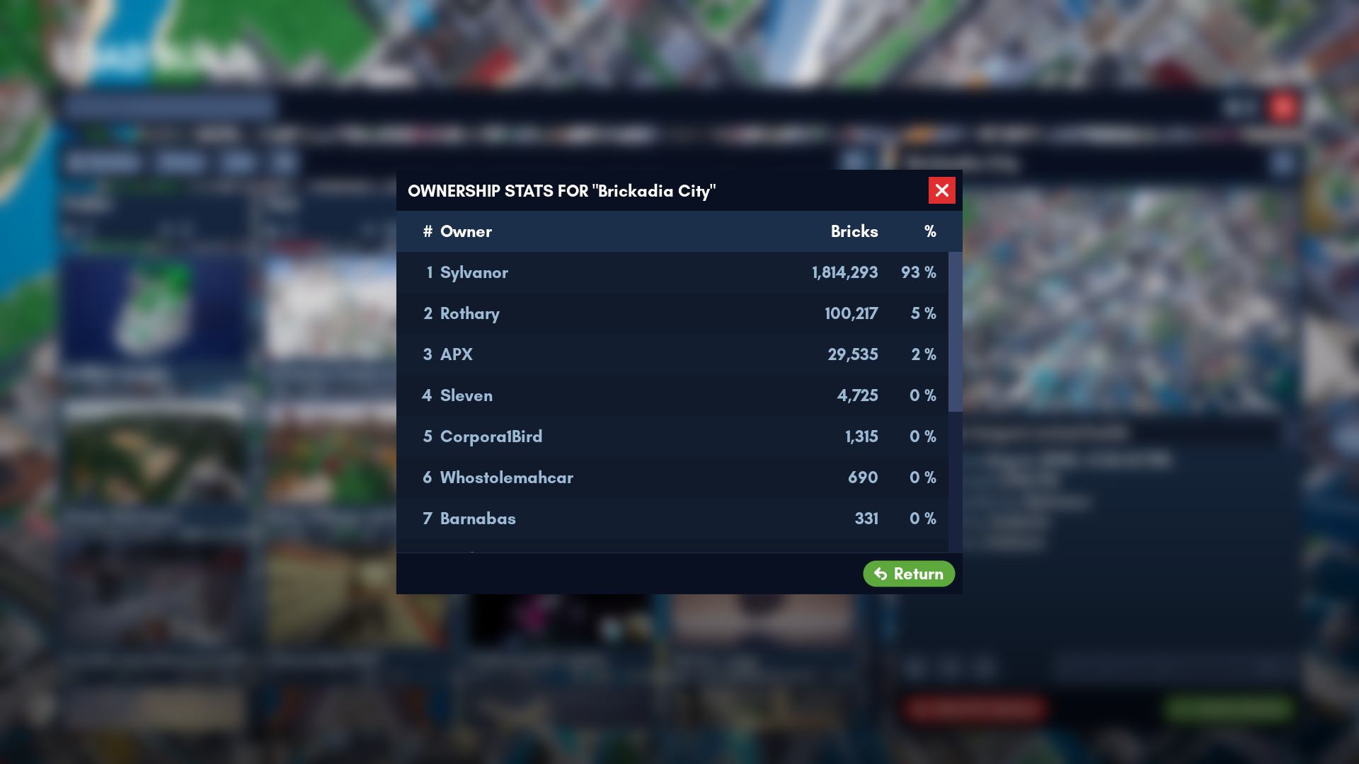
The new dialogs come packed with new features. Here are a few highlights! First, you can view who has built how many bricks in each save:
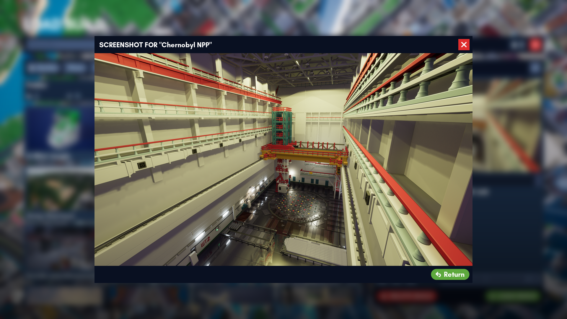
Saves can now embed screenshots. Naturally, we have a button that lets you view the full thing instead of just a preview on tiles.
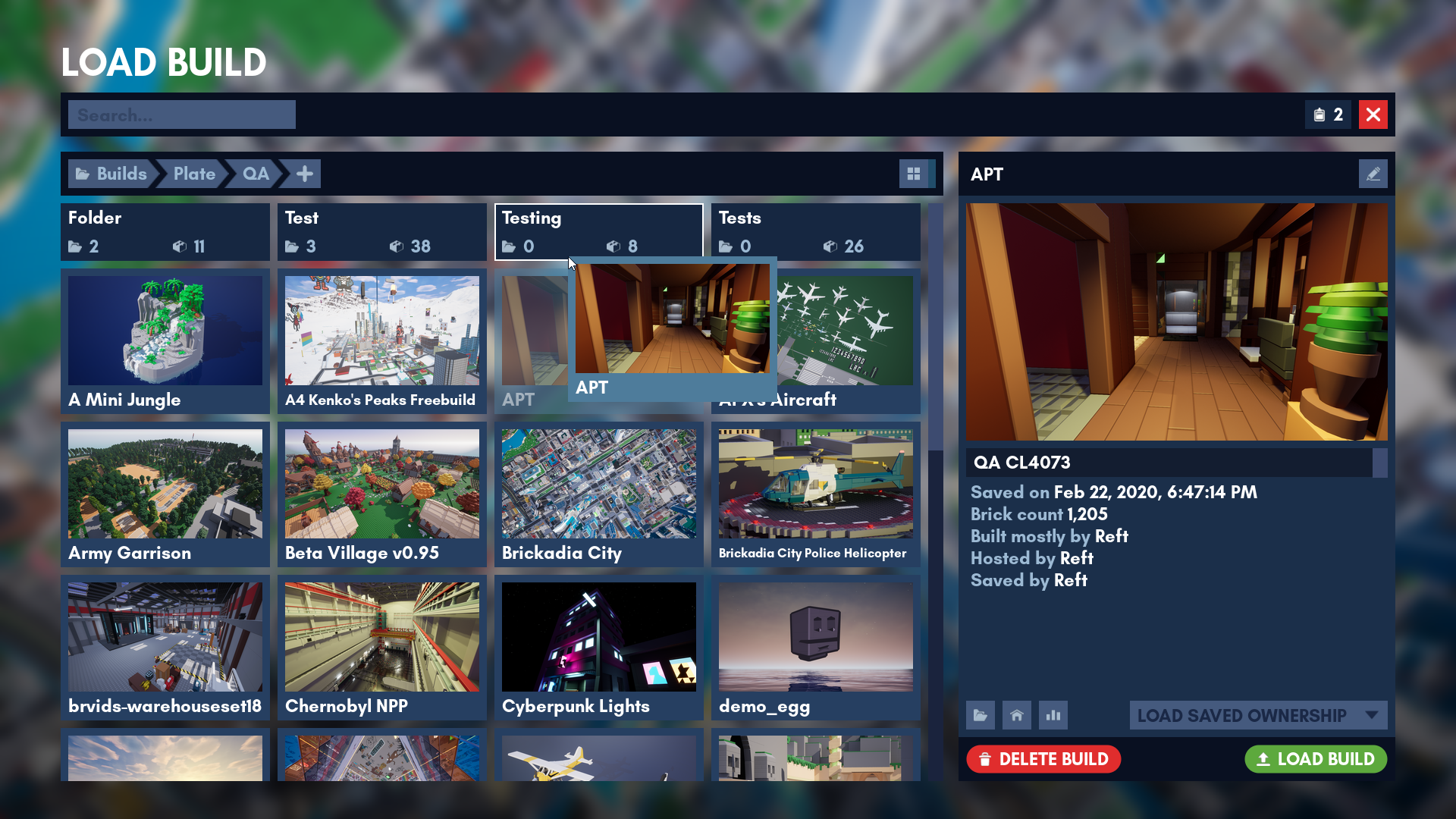
If you don't like the fancy tile view for whatever reason (why?!) then you can also view your builds in an alternative list view with a single button press:
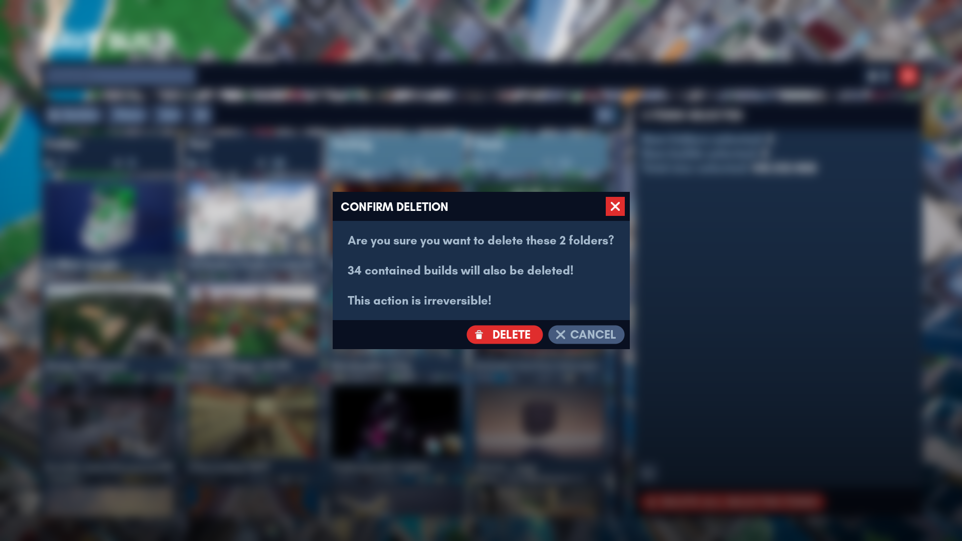
Everything dangerous that you can do with the UI comes with extra confirmation prompts, to make absolutely sure you didn't accidentally click the wrong button.
Builds and folders can be selected in the tile view and moved around with simple drag and drop, just like you'd expect from a file browser. Copying and pasting between folders is also possible. To be honest, this one is getting close to over engineering here, but it was one of the coolest things to add.
Watch it in Action
If pictures didn't do the job for you, you can also watch the two minute video below of me doing some random things with the new save/load UI. It's showing off most of the features. Recommend you watch it at 1080p and in fullscreen.
A Road Made From Only Roadblocks
Implementing one of these UIs might seem like a relatively trivial task at first glance, especially with the design already completed. However, as we've learned from this one, that couldn't be further from the truth. Just for fun, here's a list of all the problems we've encountered and had to fix or work around during the making of this 1 (one) UI:
- Simply adding all of the tile widgets to a wrap panel results in very poor performance when viewing a large folder. This can be worked around by implementing the UI based around a tile view, which only generates widgets for tiles visible on screen.
- Due to the design of the folder tiles, we weren't able to use the standard tile view widget that comes with the engine and had to make a custom version of it with support for two separate groups of tiles.
- The UMG (Unreal Engine's game UI library) tile view multi selection logic is broken and needed to be replaced entirely.
- An event for the tiles being hovered was missing from UMG.
- The tile and list views did not expose settings to customize the look of the scroll bar.
- Updating the style of a scroll bar widget did not work correctly after initially spawning it.
- The padding around tiles was computed incorrectly.
- The style and size of scroll bars on multi line editable text fields was hard coded into the engine.
- Combo boxes that have a selection sound assigned also play the sound when the UI initializes after loading a map.
- The list view sometimes failed to correctly apply padding between two rows when row visibility was updated by search.
- A blueprint compiler bug was causing the game to crash in shipping builds after opening the UI, even though it worked fine in the editor.
- The Unreal Editor crashed a total of 27 times while editing the widget blueprints.
Anyway, that's it for this blog post. Hope you had some fun reading it, stay tuned for the next one! Of course, if you have any questions or ideas, feel free to find us on Discord, Twitter, or e-mail.